
FP Advisor:
Corporate Database
Redesign
UX initiative to reinvigorate the Financial Post sibling product with accessibility and user needs in mind
Summary
Context
Organization: Postmedia Network Inc.
Industry: Financial news media
My role: UX Researcher
Team: UX designer, UX team lead
Stakeholders: UX, Product, Development, Monetization, Engagement, Marketing, and Editorial (to a lesser extent)
Objectives:
-
Address accessibility concerns
-
Research the needs and behaviours of both existing and target users
-
Test our solutions with users via usability and A/B tests
Strategy
Research Type(s): Generative, evaluative
Methodologies: Competitive analysis, site analytics (Google Analytics and HotJar), surveys, user interviews, contextual inquiry, unmoderated and moderated usability tests, A/B tests, thematic analysis, affinity mapping, rainbow spreadsheets
Timeline: 6 months
Participants: 738 survey respondents, 12 of our own users, and 30 external participants across the span of the project
Key Outcomes
-
Altogether, six behavioural archetypes were identified, each with documented user journeys, jobs to be done, pain points, etc.
-
Effectively, every primary flow on the FP Advisor tool was redesigned and tested
-
Given outside (organizational) factors and constraints, however: some designs were not implemented
-
-
FP Advisor successfully reached AODA compliance by the government deadline


The Context
-
I completed this project while working at Postmedia Network Inc., which is a Canadian-based media conglomerate consisting of over 130 properties: including the National Post and the Financial Post, most notably.
-
The focus of this project was FP Advisor, a product associated with the Financial Post
-
FP Advisor is a corporate database tool that permits users to quickly gain insights and overviews of Canadian investment markets.
-
-
The impetus for this project was an approaching AODA deadline: i.e. there were accessibility concerns regarding FP Advisor before there were broader UX concerns
The Problem
-
In July of 2020, Postmedia found itself in a precarious situation with regards to FP Advisor--the government of Ontario was requiring all government businesses to be AODA compliant (i.e. WCAG 2.1 Level AA) by the end of 2020 (later extended to June 2021)

-
Beyond basic accessibility, FP Advisor's outdated design also had impacts on other aspects of user experience, customer satisfaction, and responsiveness
-
In turn, there was concern that FP Advisor's design could hurt the 2021 fiscal year Marketing plans for packaging FP Advisor subscriptions with the Financial Post news product
-
-
Thus, the team set out to revamp this service by the end of 2020: with both AODA/WCAG 2.1 guideline adherence as well as current user feedback in mind.
-
Owing to FP Advisor largely being a legacy platform, however, insight into the contemporary corporate database market was first required. Perhaps more importantly, insight into the experiences and needs of these product users was required.

The Plan
After several kick-off meetings with key stakeholders--as well as some additional correspondence to ensure alignment--we landed on some key objectives, and I ultimately proposed the following approach:
-
Accessibility research
-
Initially I proposed using this time as an opportunity to begin building relations with non-profits and begin to sew the seeds of an accessibility research process at Postmedia, but this was deemed out of scope
-
In the end, the UX director re-scoped this portion of the project to only include secondary research and heuristic analyses
-
-
Competitive analysis
-
Also included secondary research
-
In addition, I interviewed users of competitor products
-
-
Primary research (user interviews)
-
In addition to users of competitor products, we obviously wished to interview our own users
-
This combination of external and internal users would be foundational to our user archetypes/personas, as well as user-journey and jobs-to-be-done research
-
-
Finally, after prototypes were complete, remote moderated usability testing
-
Due to unique, unforeseen circumstances: this had to be supplemented with unmoderated testing as well (i.e. UsabilityHub)
-
Accessibility Research
-
First, before addressing any of our other design concerns, it was imperative that we focus on the primary purpose of the project: accessibility
-
I had initially planned to begin a research practice of consistently working with participants who used different accessibility tools; however, this was deemed to be out of scope
-
Instead, I conducted secondary research: both with W3C's own resources, as well as those of recognized accessibility and design authorities
-
e.g. Nielsen Norman Group, Canadian National Institute for the Blind (CNIB), etc.
-
-
Though this research was largely conducted at the onset of this project, it remained necessary throughout
-
i.e. I effectively became a subject matter expert at the time to facilitate the design process: answering any WCAG-related questions and pointing out any potential concerns
-
Competitor Research
-
Next, I started with broadly researching our competitors: just using simple, publicly-available resources
-
I also documented screen flows of some competitor products, based on YouTube video tutorials for the platforms in question.
-
Finally, I compiled an affinity diagram of themes present in G2 reviews of competitor products. This includes some insights regarding use cases, as well as feedback regarding pain points and sources of delight
-
Combined with feedback regarding functionality, I was simultaneously seeking out data regarding which product features were "attractive qualities," from a Kano model perspective
-


Fig.2. Affinity map of themes present in G2 reviews of PitchBook, Crunchbase, and CB Insights
Fig.1. Screen flows that I documented from PitchBook, Crunchbase, and CB Insights using publicly available video tutorials
-
Though this research did procure several key findings, I nonetheless wanted to hear from the users themselves
-
Though we had a limited budget, I was able to conduct interviews with three corporate database users (i.e. of competitor platforms) to learn about their usage habits and general needs and behaviours.
-
These participants were selected from a pool of 40 screener respondents
-
-
Participants also walked through uses cases with their platforms of choice using screen share.
Discovery Research: HotJar, Interviews, and Contextual Inquiry
Recruitment
-
When it came time to speak with our own users,
I recruited by two primary means:-
Mailchimp recruitment of our Financial Post users who either used FP Advisor regularly at the time, or who were otherwise familiar with the product
-
HotJar survey recruitment on the FP Advisor home page itself
-
This would prove to be a far less effective method, but one that did procure some participants nonetheless
-
-

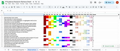
Fig.3-4. Rainbow sheet with data from the 18 participants I spoke with while constructing the user behavioural archetypes and user journeys


Fig.5-6. Selected, high-level information regarding the project's resulting behavioural archetypes, followed by an aggregated, high-level user journey map intended for a workshop.
-
Altogether, I spoke with 18 individual users/participants (selected from a pool of 90 screened respondents)
-
The goal was to have all user behavioural archetypes represented
-
Some of these archetypes proved to be more difficult to recruit than others
-
e.g. Executives were particularly challenging to recruit, likely owing to the sheer value of their time
-
We did, however, find some success by working with the product owner and interviewing recent corporate clients FP Advisor that had volunteered to provide feedback and insight
-
Through similar means, this is how I was able to speak with some of our Service Provider archetype representatives: e.g. a corporate librarian and corporate lawyer
-
-
-
Methods
-
Over the span of approximately one month, we held remote, moderated sessions with individual participants
-
These sessions were 30 minutes in length, for which participants were compensated $30 USD for their time and contributions and required to sign a non-disclosure agreement
-
Each session comprised of two components: an interview portion and a contextual inquiry portion
- This allowed me to watch how they actually interact with their preferred financial products
-
Stakeholders were encouraged to join, and many did: offering crucial follow-up questions and input!
Key Insights
We discovered that...
-
Investment experience plays a significant role in how users interact with investment tools, with more experience equating to a more patient approach to investing.
-
Out-of-date content was found to essentially be a universally held pain point
-
For all archetypes, there was often some social component to their investment behaviours and practice
-
e.g. Investment group chats, Discord servers, providing investment advice to colleagues and loved ones, etc.
-
Evaluative Research: Testing our Designs
Recruitment
-
For the sake of expediting the process, it was decided with stakeholders that we interview external participants
-
i.e. All of our participants for this portion of the project were recruited via Respondent.io
-
-
Altogether, I spoke with 18 individual users/participants: selected from a pool of 177 screener respondents
-
Again, the general goal was to have all user behavioural archetypes represented, although some archetypes were largely left out for the scope of the project at hand

Fig.7-8. Mobile and desktop versions of a home page mock-up for FP Advisor.
Methods
Over the course of two months, I conducted four rounds of remote, moderated usability tests
-
These tests focused on either flows or elements of concern--as discovered in my initial research--namely:
-
The home page and navigation bar
-
The Corporate Snapshot flow: i.e. high-level research
-
The Corporate Analyzer flow: i.e. in-depth research
-
Leads list generation: i.e. flow for identifying potential corporate partners and customers
-
Unmoderated usability testing (i.e. UsabilityHub) was also incorporated for the leads list generation flow
-
This was done so as to compare two solutions/designs
- i.e. A/B testing
-
-
Key Insights
Naturally, feedback for individual pages and flows varied greatly; however, the following themes did recur throughout the study:
-
Jargon needed to be reduced, and language made more accessible
-
Frequently-used tools and flows needed to be better highlighted
-
Forms needed to be simplified and made less overwhelming
-
A simple accordion approach to hiding unnecessary information proved to be highly effective!
-

Moderated usability test participant
“The terms are so technical…those terms need to be broken down into simple English. For example, if I give [this] to my mom, she won’t even know how to look at a company.”
Impact
Outcomes
-
The documented behavioural archetypes, as well as their respective user journeys and jobs to be done, remained relevant to Financial Post design work throughout the 2021 fiscal year
-
The platform was successfully redesigned in its entirety, and met successfully met AODA compliance by the extended June 2021 deadline
- That said: the product was ultimately deprioritized from a Marketing standpoint
- Though the beta was successfully launched and did make it through the development cycle, it largely remained a tool used internally and by corporate clients
- i.e. Reaching the broader consumer market was no longer the goal
- Though the beta was successfully launched and did make it through the development cycle, it largely remained a tool used internally and by corporate clients
Lessons Learned
-
This project proved to be highly insightful to me from a personal investment/finance perspective, given my limited experience
-
It was exciting to be able to apply the insights I had gathered in my user research into my own personal life
-
-
More importantly, however: this project was a lesson in humility
-
Though we were very enthused about this project, it was important to learn and bear in mind that organizations have many (conflicting) projects and priorities, and these are subject to change
-
As professionals, we must simply move forward and adapt to changing business needs
-
Tools Used:

HotJar:
For screen recordings, heat maps and site surveys

Figma:
To collaborate with the designer and team

Jira
For staying aligned with cross-functional team

UsabilityHub:
For unmoderated usability and A/B testing

Marvel:
For testing prototypes

Confluence
For documentation and cross-team alignment

Typeform:
For constructing surveys
Google Sheets
For rainbow sheets and thematic analyses

Lookback:
For remote interviews, contextual inquiries, usability sessions, etc.

Mailchimp:
For circulating surveys

Airtable
For long-term research records

Mural:
For affinity mapping, early empathy maps, journey mapping, and workshops

Respondent.io
For external recruitment
